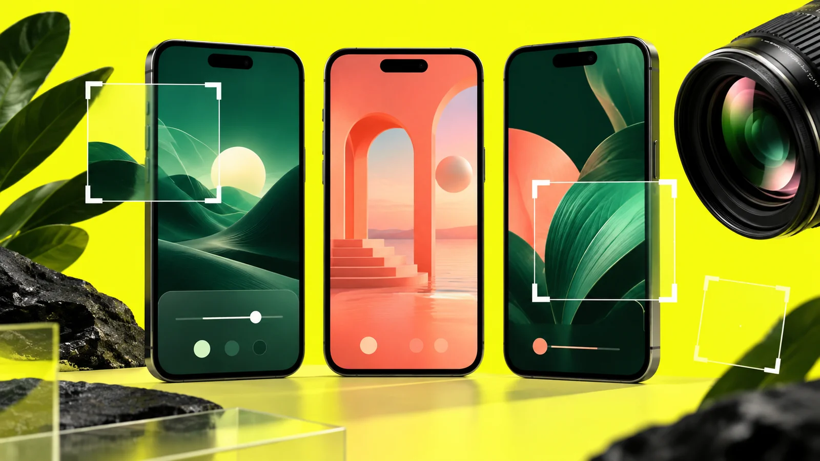
A screenshot campaign should help someone understand the product before installation. Decorative depth and strong typography can help, but the interface shown must remain faithful to the app people will receive.
Capture a clean source set
Use a current build with synthetic data. Disable personal notifications and select screens with meaningful content. Capture the main task, its result and a useful secondary feature. Keep originals so the final design can be checked against the app.
Build a simple story
Give each image one job. Start with the core benefit, then show how it works and what the user gets. Avoid repeating the same home screen with different headlines. At thumbnail size, one clear screen is often more useful than a crowded collage.
Design around the interface
Use readable contrast, consistent spacing and restrained device framing. Do not generate replacement UI with AI and present it as a real capture. If AI is used for backgrounds, keep invented imagery separate from product evidence.
Localize and validate
Translate visible campaign copy and capture localized app screens when available. Check long text, cropping and current Play asset requirements for each device category. Do not reuse a phone layout blindly for a tablet or watch.
Avoid fake ratings, unsupported awards and promises of results. Review the exported files on a small screen before upload. After release, compare listing performance using available measurement tools, but do not assume that a visual redesign alone guarantees more installs.
Official reference
Related guide
Before applying for production access: organize your test evidence
Coordinate your test
Managed plans start at US$15 per app. Check the scope before ordering; production approval remains Google’s decision. Compare TesterSplay plans
Illustrative cover generated with AI; not an actual Play Console screenshot.
Share this article